NSCAD alumni and designers, Angela Henderson (MFA 2016) and Jayme Spinks (MDes 2015) have won the Alcuin Society Book Design Awards for their work in Solomon Nagler’s recent book, piyyut.
The book was designed and published by Spinks’ independent publishing company, Nevermore Press and Copy Shop Books, and feature illustrations by Henderson. The book was selected as winner in the poetry book category and will be entered into the Best Book Design from all over the World competition, conducted by Stiftung Buchkunst in Germany.
piyyut, a long form poem by filmmaker and NSCAD faculty Solomon Nagler, assembles fables from the Jewish Diaspora in an effort to unsettle refugee migration stories while exhuming mystical, prophetic voices in post-Holocaust Europe. Each verse is paired with a drawing by visual artist Angela Henderson, exploring the intersections between graphic notation and lyrical, poetic form. Combining and juxtaposing digital—and hand-rendered—elements, the hybridized landscapes respond to and reflect the complex, speculative and sometimes brutalist journey through past and present.
As a winner, piyyut will tour across Canada with winners from other genres. A set of the winning books will be sent to Stiftung Buchkunst to be included in the Frankfurt Book Fair and the Leipzig Book Fair. The winning books from the Alcuin Award will be Canada’s entries in the Best Book Design from all over the World competition.
We caught up with Jayme Spinks to hear more about the collaboration.
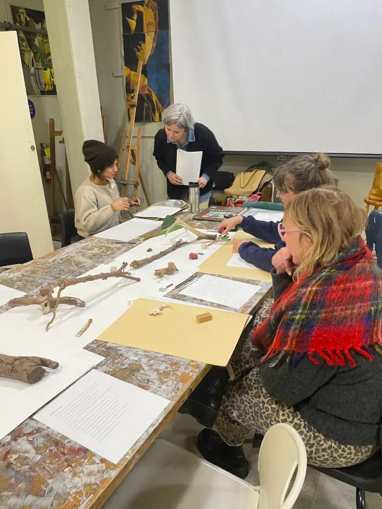
Design and layout session for “piyyut” led by Angela Henderson. Credit: Courtesy
Can you describe how the piyyut project came about? How did the three of you work together?
Sol had been talking to me for a while about his poetry manuscript. Nevermore Press doesn’t really publish traditional poetry, but once I came to understand that each verse was being paired with an interpretive drawing by Angela, I knew it could fit into our catalogue, especially as a co-production with our visual imprint, Copy Shop Books.
I have worked on two book projects with Sol before, but his role was co-editor, not author. Sol has always trusted me and my design decisions, and even though this project was far more personal, he allowed me complete freedom to interpret the work. Angela was equally open about the integration of her work, and by the end it really did feel like a three-person collaboration.
What was your inspiration for the book design? What elements did you introduce in the design and how did it complement Sol’s poetry and Angela’s drawings?
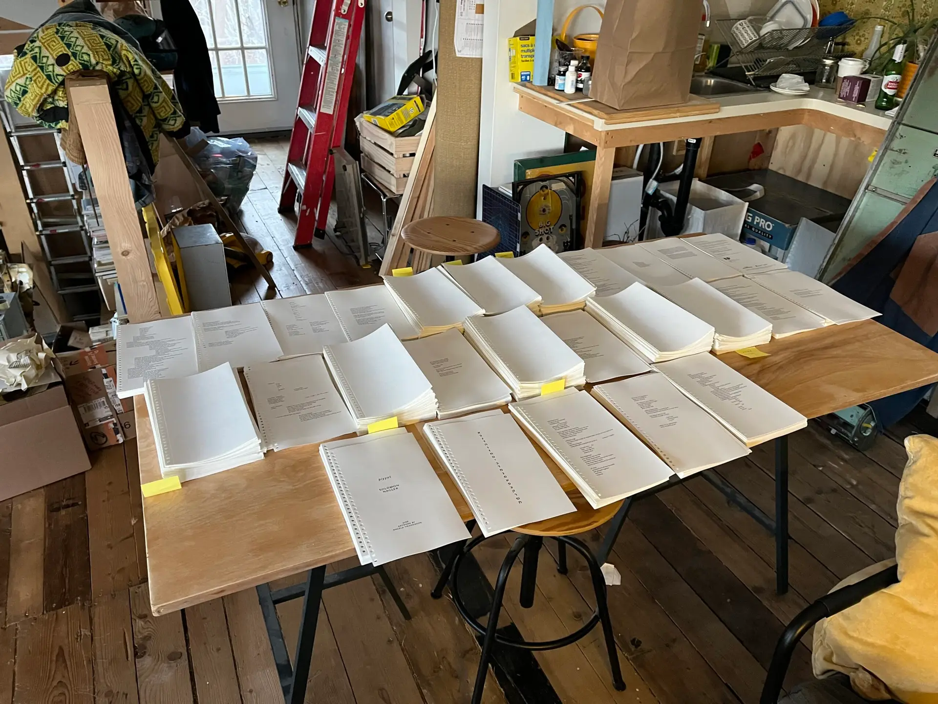
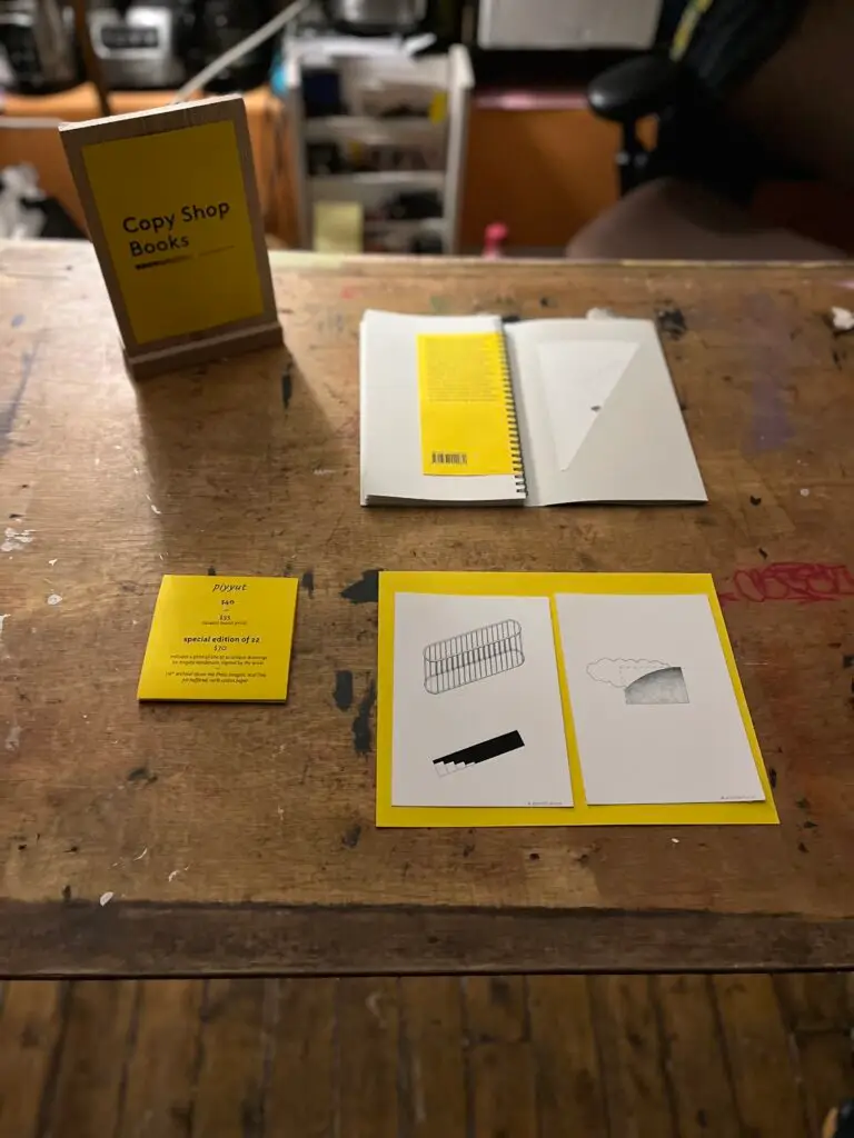
A lot of the design decisions were based on a combination of aesthetic and practical reasons. From the start, I knew I wanted the book to feel somewhat ‘utilitarian,’ which was reflected in its use of simple office materials—black wire-o binding; black-only laser printing; single hole punches on the cover; drafting vellum for the drawings; yellow copy paper as the only pop of colour. The poetry and drawings were equally simple and grounded, so I wanted the material choices to reflect that.
Additionally, the use of the wire binding allowed for the inclusion of a mix of materials and page sizes. We used recycled uncoated stock for the poetry, with pages that folded out to accommodate longer verses, and cotton vellum to stay true to the CAD and graphite architectural-like drawings. This would not have been financially possible if production had been done commercially.
The covers are hand-punched, the yellow interior cover sheets hand-glued, interior pages hand-folded, hand-punched and bound, all for the same reason. All of this meant each copy took time to make, but because we’d planned a limited run from the start (100 standard editions, 22 special editions), it was manageable (especially with the help of my friend Kira). I hope these elements make the book feel extra special.
What do you want the reader to experience when they pick up and read piyyut?
For any book I make, I want the reader/viewer to feel like it was worth producing the physical object. Could piyyut have been an ebook? Sure. But I think there’s value in having something special to hold in your hand, and to be able to contribute another layer to the content through tangible elements that would be impossible to express digitally.
How did you react when you heard you won an Alcuin Award?
I was very pleased! I’m proud of how the book turned out, and it was nice to be recognized for the efforts.
Are art books having a moment? Can you tell me more?
We’re definitely seeing more opportunities in Canada to showcase art books.
There’s no real art book distribution system for us here, so new(er) art book fairs like Halifax Art Book Fair (co-founded by NSCAD alumni), and Ottawa’s Object//Project Art Book Fair are crucial for East Coast bookmakers to network and share their work. Art books often attract a more niche audience than, say, a traditional novel, so it can be hard to find places to sell and reach the folks who might be interested.
The publishing industry is very challenging, especially for small publishers, and even more for publishers making weird and non-traditional publications.
The recent complete elimination of Nova Scotia’s Publishers Assistance Fund in July and extreme cuts to other critical Nova Scotian arts funding by the Houston government shows their lack of respect and value for the work we’re doing to showcase the diversity of Atlantic talent. These cuts will, without a doubt, make books like piyyut almost impossible to publish moving forward in this province, which is truly a shame.
What’s next for the book and for your team?
According to the Alcuin Society, piyyut is being sent to Vancouver, where it will be photographed for the catalogue and then join the group of prior winners held at the Special Collections and Rare Books Division of the W.A.C. Bennett Library at Simon Fraser University. There are exhibitions of the winning books being planned at the Library of McGill University, the Library of the National Gallery of Canada, Muskoka Chautauqua, Toronto Metropolitan University, University of Alberta, University of Victoria, Winnipeg Public Library, with more locations in the works.
A separate copy of piyyut will be exhibited at the Frankfurt Book Fair in the fall and then at the Leipzig Book Fair at the beginning of 2027, where it will be one of Canada’s entries in the competition called Best Book Design from all over the World, conducted by Stiftung Buchkunst. This copy will stay in Germany where it and the other winners are held in Deutsches Buch-Schriftmuseum in Leipzig, a part of the National Library of Germany.
For our team, there are lots of exciting things in the pipeline!
Right now, Copy Shop Books is finishing up Dust of the Sun, a book about Halifax-based senior artist Edith Pahlke’s incredible linocuts from the 1960s and ’70s. It’s been a big project and includes two essays by prominent design figures: internationally renowned graphic artist Marian Bantjes, and historian and typographer Dr. Shelley Gruendler. The book is available for pre-order and we’re releasing the first in a new series called ECHO PAPER, the brainchild of Hannah Guinan and a co-publication with The Khyber Centre for the Arts. This first book will feature the work of NSCAD alum Arjun Lal.
Additionally, Trap Door Books, the young readers’ imprint of Nevermore Press, will be releasing the sequel to the 2024 middle grade novel, Pet Tales, by Nova Scotian author Heidi Tattrie Rushton this fall.
It’s a pretty exciting season and we can’t wait to share our works with the community.
Nevermore Press acknowledges the support of the Canada Council for the Arts, and the Province of Nova Scotia’s Department of Communities, Culture, Tourism and Heritage in making piyyut.